An Introduction to CSS Transitions!
CSS transitions are an easy way to add animations to your design. When using CSS transitions, the value of a property increases smoothly.


Introduction:
It is possible to create animations in CSS using CSS Transitions or CSS Animations. In this article, we'll focus on CSS Transition and its properties.
CSS Transitions:
CSS transitions are an easy way to add some extra pizzazz to your design. You can use CSS transition properties to control how an element changes when a user hovers over it within a set amount of time.
There are four properties that you can use to create CSS transitions:
transition-property
transition-duration
transition-timing-function
transition-delay
div{
        height: 100px;
        width: 300px;
        background-color: blueviolet;
        transition: width 1s;
}
Now specify a new value (500px) on the hover class for width; it was 300px before. When a user hovers over it, it will change the width from 300 to 500.
div:hover {
       background-color: blue;
       width: 500px;
}
Transition properties:
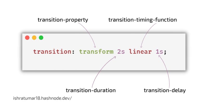
1. transition-delay
It describes: how long does it take for a transition to start? After a specified time, the animation will begin when the user hovers over an element. In the code snippet below, the animation will start one second after the user points over it.
transition-delay: 1s;
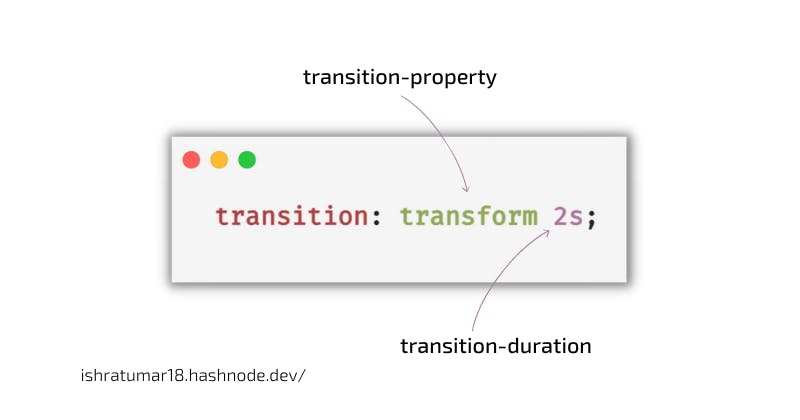
2. transition-duration
It specifies the time in milliseconds or seconds needed for a transition effect to complete.
transition-duration: 2s;
3. transition-property
This property specifies the name of the property that will receive the transition effect.
transition-property: transform;
4. transition-timing-function
The speed curve of the transition effect can be determined using the transition-timing-function property.
The timing function you choose for your animation will determine how it plays out. For example, if you choose a linear timing function, your animation will have an even speed between the beginning and end. It means that elements will move linearly from one side to the other.
If you choose an ease-in-out timing function, your animation will start slowly and end slowly, with a slightly faster middle.
The transition-timing-function property can have the following values:
- ease - This is the default transition effect.
linear - Same speed the whole time.
ease-in - It starts slow and ends fast.
ease-out - It starts fast and slows down at the end.
ease-in-out - It starts slow, speeds up in the middle, and slows down in the end.
cubic-bezier(n,n,n,n) - This allows you to set your values using a cubic-bezier function.
Syntax:
transition-timing-function: linear;
CodePen Demo:
5. transition (shorthand)
It is a shorthand property that you can apply to set all four transition properties in a single line of code. Using shorthand properties reduces code, but newbies may have difficulty understanding them, so some developers don't recommend them.
You need two things to make the transition work properly. First, select which CSS property you want to add a transition. Additionally, you need to identify how long the effect will last.
The illustration below shows what I mean:
Shorthand:
transition: transform 2s linear 1s;
Shorthand property visual explanation:
Code Example:
In the example below, when you hover over the parent element, the child element moves from the top to the bottom, which takes 2 seconds to complete the effect.
HTML:
<div class="parent">
        <div class="child"></div>
</div>
CSS:
.parent{
        display: flex;
        align-items: center;
        justify-content: center;
        background-color: black;
        width: 100%;
        height: 400px;
      }
.child{
        height: 100px;
        width: 300px;
        background-color: blueviolet;
        transition: transform 2s;
      }
.parent:hover .child{
        background-color: aqua;
        transform: translateY(100%);
      }
CodePen Demo:
It is always recommended to set the transition property to the base class (child in this case) and not to the modified class (hover class). When applied to a child class, the element will move smoothly when the mouse is over it. Also, it will move back smoothly if the mouse is removed.
When you apply it to the modified class, the hover state is not applied to the base element. As a result, no smooth animation will occur when you remove the mouse from the child class in this case.
Design Buttons/Menus
When a user hovers their cursor over an element to highlight that element, it is simple to do that with CSS Transitions. Check out the example below:
HTML:
<button>Hover Over Me</button>
CSS:
button {
  background-color: purple;
  color: #fff;
  border: 1px solid;
  padding: 2rem;
  text-align: center;
  transition: all 0.5s ease-out;
}

button:hover,
button:focus {
  background-color: #fff;
  color: #333;
}
CodePen Demo:
Learn more about CSS Transitions:
Wrap up
That's all we can do with transitions. We can't get any more complex with CSS transitions. For example, if we want to move an element in a circular motion, we can't do it with the transition. That's where CSS animations come in. That's something we'll talk about in the article that comes after this.
I sincerely hope you find this helpful. If so, share it with others and follow me on Twitter at @ishratUmar18 to stay in touch.
Congratulations on reading the whole thing! What an awesome reader you are! :) 🙌🏻