

How to create an image gallery using Tailwind CSS
Beginner's tutorial on how to start using Tailwind CSS


If you’re just getting started or know nothing about Tailwind CSS, this is for you. After reading this and following along, you will understand how Tailwind CSS works. You will learn how to design stunning applications without writing plain CSS code.
Here we go! If you’re ready, let’s get started!
If you have never used Tailwind CSS before, your first question may be, “What is Tailwind CSS, and why do we use it?”
So, Tailwind CSS is a framework that offers a collection of pre defined classes that let you create fully customized designs without ever leaving your HTML.
Even though Tailwind CSS default classes can be very useful, you can also customize them to meet your unique requirements. You can do this by modifying the default configuration file.
Using the @apply directive or the new utility classes made with the @layer directive, you can also make your own unique classes.
Installation
To continue working on it, you need to set up Tailwind CSS on your computer. Do not worry, I will show you how to do that; it is really simple. You can install Tailwind CSS using npm, yarn, or any other package manager.
To install with npm, copy and paste the following command into your terminal and press the Enter key:
npm install -D tailwindcss
To install with yarn, run the following command:
yarn add tailwindcss
It will install Tailwind CSS in your project’s root directory.
After that, copy and paste the following code into your terminal and press Enter again.
npx tailwindcss init
This will generate a tailwind.config.js file that you can find in the root directory of your project.
Configuration
Add the code below to your tailwind.config.js file to configure the paths to all of your template files.
/** @type {import('tailwindcss').Config} */
module.exports = {
  content: ["./src/**/*.{html,js}"],
  theme: {
    extend: {},
  },
  plugins: [],
}
Importing CSS
Add the following code tailwind directives to your main CSS file.
@import 'tailwindcss/base';
@import 'tailwindcss/components';
@import 'tailwindcss/utilities';
Initiate the building process
Execute the CLI tool to scan your template files for classes and build your CSS.
npx tailwindcss -i ./src/input.css -o ./dist/output.css - watch
Use Tailwind in your HTML
Tailwind CSS provides a lot of utility classes that can be used to apply styles to your HTML elements.
For example:
<!doctype html>
<html>
<head>
  <meta charset="UTF-8">
  <meta name="viewport" content="width=device-width, initial-scale=1.0">
  <link href="/dist/output.css" rel="stylesheet">
</head>
<body>
  <button class="bg-blue-500 hover:bg-blue-700 text-white font-bold py-8 px-16 m-10 rounded-full">
   Click me
  </button>
</body>
</html>
In the example above, the text-white class sets the text color to white, the font-bold class sets the font weight to bold, the py-8 and px-16 classes set the padding to 8 and 16 respectively, the m-10 class adds a margin of 10, and the rounded-full class adds rounded corners to the button. The hover:bg-blue-700 class changes the background color to a darker blue on hover.,
See the result of the code above in the example button below.
What you will see in the browser:

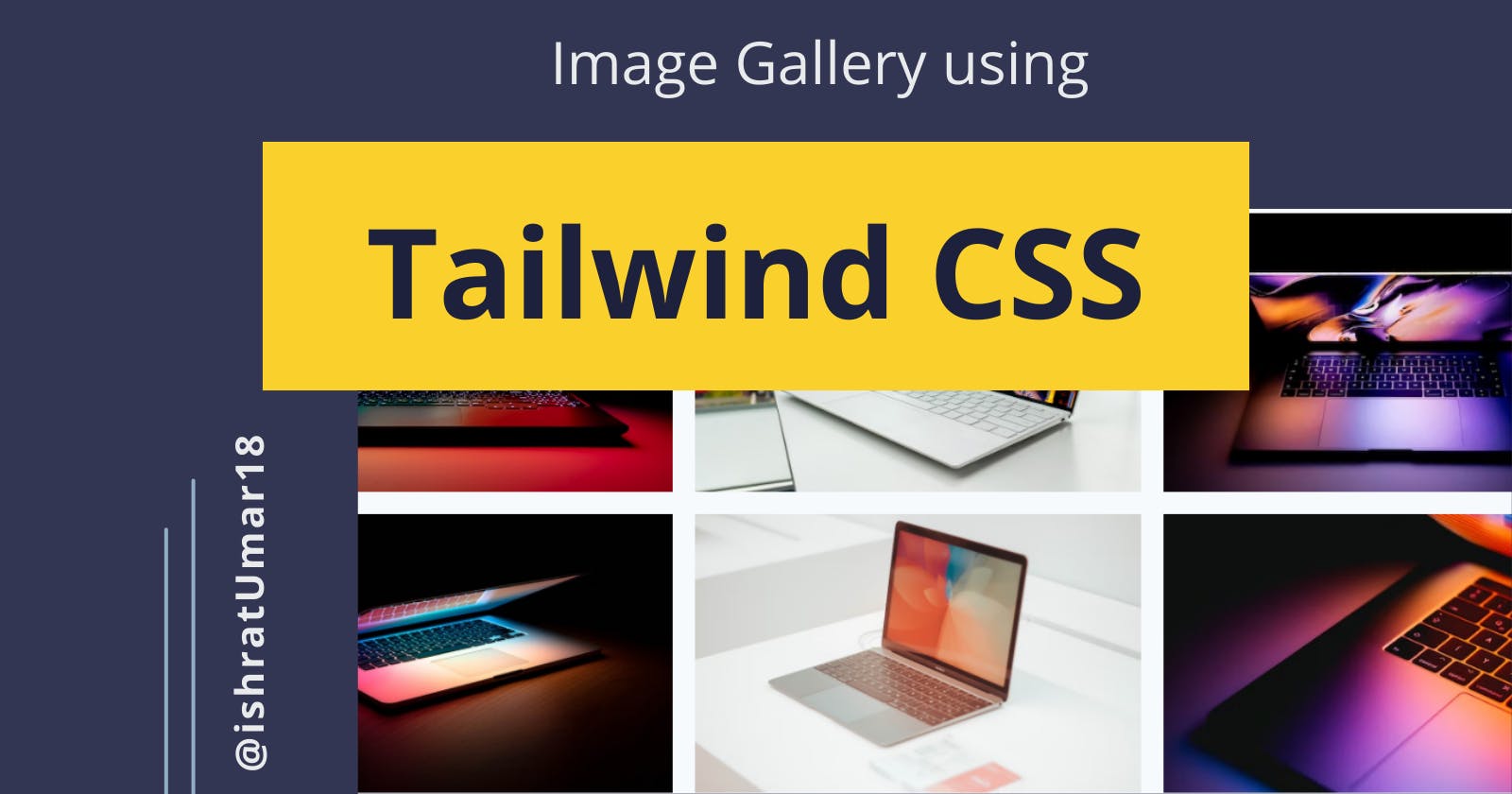
Tailwind CSS Image Gallery
Let’s use Tailwind CSS to build a simple photo gallery application. In this tutorial, you will learn to create a simple six-image photo gallery: 3 images in the first row and 3 in the second row. You can easily modify the code to include extra rows and images and create your very own unique and beautiful image gallery. I also added a small hover animation to make it more interactive.
HTML
At first, Tailwind CSS may seem overwhelming, but as you get more comfortable with it, you’ll find that it makes your life 10x faster than writing plain CSS.
Also, if CSS is your area of expertise, picking up Tailwind CSS will be a piece of cake for you. For this reason, you should learn CSS before using its frameworks, such as Tailwind CSS or Bootstrap. Learn the language first, then explore its frameworks — this rule applies to all languages, not only CSS.
The code below is not rocket science; it is just simple HTML and Tailwind CSS classes used in the code below to style your HTML components. Add this to your index.html file by copying and pasting.
When you use Tailwind CSS in your projects, your HTML will look something like this:
<!DOCTYPE html>
<html lang="en">
    <head>
    <meta charset="UTF-8">
    <title>Image Gallery</title>
    <link rel="stylesheet" href="style.css">
  </head>
  <body class="bg-gray-100 h-screen">
    <div class="container mx-auto px-4">
      <div class="grid grid-cols-3 gap-4 mt-10">
        <div class="bg-cover"
         style="background-image: url(image-url)">
        </div>
        <div class="bg-cover"
        style="background-image: url(image-url)">
        </div>
        <div class="bg-cover"
        style="background-image: url(image-url)">
        </div>
        <div class="bg-cover"
        style="background-image: url(image-url)">
        </div>
        <div class="bg-cover"
        style="background-image: url(image-url)">
        </div>
        <div class="bg-cover"
        style="background-image: url(image-url)">
        </div>
      </div>
    </div>
  </body>
</html>
Let’s learn what each class does. In this example, the grid class creates a grid with three columns, the gap-4 class specifies a gap of four units between each column, and the container class sets a maximum width for the container and centers it horizontally. The bg-cover class sets the background image to cover the entire element, and the bg-gray-100 class sets the background color to light gray. The height of the body is set to full-screen height using the h-screen class.
CSS
You need to import Tailwind CSS into the CSS file first if you’re using the CodePen editor. On a local machine, all you have to do is install and configure it using the methods mentioned above, and you’re good to go. Just copy the code, paste it into the appropriate files, and run the application.
@import url('https://cdn.jsdelivr.net/npm/tailwindcss@latest/dist/tailwind.min.css');

@import url("https://fonts.googleapis.com/css2?family=Poppins:wght@400;500;600;700;800;900&display=swap");

@tailwind base;
@tailwind components;
@tailwind utilities;

/* Animations */
@keyframes fadeIn {
  0% { opacity: 0; }
  100% { opacity: 1; }
}

@keyframes slideIn {
  0% { transform: translateY(50px); opacity: 0; }
  100% { transform: translateY(0); opacity: 1; }
}

.bg-gray-100 {
  background-color: #f7fafc;
}

.h-screen {
  height: 100vh;
}

.container {
  width: 100%;
  padding-right: 1rem;
  padding-left: 1rem;
  margin-right: auto;
  margin-left: auto;
}

.mt-10 {
  margin-top: 2.5rem;
}

.grid {
  display: grid;
  grid-template-columns: repeat(auto-fit, minmax(250px, 1fr));
  grid-gap: 1rem;
  justify-items: center;
}

.grid-cols-3 {
  grid-template-columns: repeat(3, minmax(0, 1fr));
}

.gap-4 {
  gap: 1rem;
}

.bg-cover {
  background-size: cover;
  background-repeat: no-repeat;
  background-position: center center;
  height: 200px;
  width: 100%;
  cursor: pointer;
}
.bg-cover:hover {
  transform: scale(1.05);
  transition: transform 0.3s ease-in-out;
}
What you will get

CodePen
Wrap up
That’s all for today! With these steps, you will understand how to use Tailwind CSS in your projects. You can learn more about Tailwind CSS and its features from the Official Documentation. Don’t forget to mention me on Twitter when you build your beautiful image gallery using Tailwind CSS. Also, follow me for more content and subscribe to my newsletter to read the posts directly in your email, so you don’t have to open a browser to read.
Happy building :)